Monday, November 30, 2015

Lab 14 - Spatial Data Aggregation

The main objective of this lab was to become familiar with the Modifiable Area Unit Problem (MAUP), to analyze relationships between variables for multiple geographic units, and to examine political redistricting, keeping the MAUP in mind.

The MAUP is impacted by two components: the scale effect and the zonation effect. The scale effect is attributed to the variation in numerical results owing strictly to the number of areal units used in the analysis. The zonation effect is attributed to the variation in numerical results owing strictly to the manner in which a larger number of smaller areal units are grouped into a smaller number of larger areal units.
 First, we were to examine the relationship between poverty and race using different geographic units, ranging from large numbers of small in area units (original block groups) to small numbers of units large in geographic area (House voting districts and counties). After doing this, the general pattern was that lower poverty percentages correlated with a small percentage of non-white residents. As the percentage of non-white residents, the poverty level tended to increase. As discussed in the lecture and readings, the correlation increased with smaller sample size as demonstrated by the increase in the R-square values. Not only can the number of polygons change the results, but also the area that each polygon covers can change the numerical results when comparing the census variables. The key to minimizing the impact of the MAUP on any analysis is to be consistent both in the geographical size and the number of areal units used.

Next we investigated the MAUP in the context of gerrymandering, which is to manipulate district boundaries in order to favor one political party or another. We wanted to determine which existing congressional districts deviate from an ideal boundary (i.e. which have been drawn in the context of gerrymandering the most) based on two criteria: 1) Compactness, i.e. minimizing bizarre shaped legislative districts, and 2) Community, i.e. minimizing dividing counties into multiple districts.

To measure compactness, I found a “compactness ratio” online that describes compactness as the area divided by the square of the perimeter. After doing this in ArcGIS, I see that values with a higher compactness ratio are districts that have a more geometric shape (i.e. rectangles and squares) and those with lower values are abnormally shaped districts. The compactness ratio seems to be a 2D version of the isoperimetric inequality, which is a geometric inequality relating the square of the circumference of a closed curve in a plane and the area of the plane it encloses. Larger ratio values describe a smooth or contiguous shape. For example, the rectangular state of Wyoming appears to be one congressional district and has one of the highest values for “compactness ratio”. An example of one of the "least compact" districts seen below.


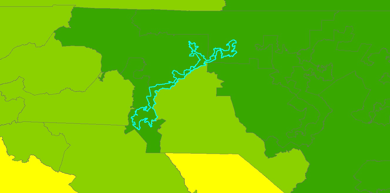
As you can see, this district is a bizarre shape. It's very long and skinny and has a lot of curves, kinks, and strangely shaped boundaries.

To measure community, I want to find areas in which one district encompasses an entire county, not necessarily only that county, but we want counties that are not broken up by congressional district boundaries. I had trouble with this part, as I was able to determine the number of districts within each county using a union and a spatial join, which shows the extent to which some counties are broken up into several districts, but I'm not sure this is the entire answer. Below is an image of Los Angeles County, CA, the county with the most congressional districts (24).


Friday, November 27, 2015

GIS Day Activities

I was working at my internship location as well as at least one other person in the internship program and did not get to attend a GIS day event. I don't think there were any nearby anyway. I was able, however, to lead a discussion/presentation on the current progress of the GIS project that I am doing. For the state of Arizona, I have merged crop data (location, type of crop, type of irrigation) provided by the USGS into one large dataset, to which I have added the temperature that a crop will be damaged due to a freeze (heat damage temperature is also in the dataset). The objective is to create a risk assessment that eventually can be used as part of a National Weather Service forecast. Hopefully, once a working model is developed, the idea can be pushed up the hierarchy to the regional or national level. We have had some issues getting it to work with using the proper coordinate system, but actually QGIS handles this problem better than ArcGIS, surprisingly. Additionally, we want to go that route anyway, as many don't have an ESRI ArcGIS license (too expensive and QGIS is free). The presentation on GIS Day detailed some of that and I found that the merged dataset is really helpful to the USGS community as well, as they do not have all this data in one place, which also surprised me. The data I added to their dataset (the crop temperature and rainfall needed data) came from USGS and a website I found called EcoCrop, originally developed by the Food and Agriculture Organization (FAO) of the United States. The location of crops was originally determined via satellite imagery and later double-checked by USGS personnel on the ground. People seem to be pleased with the progress made so far, and it will be up to the rest of the team to finish getting the temperature data loading properly with QGIS to finish up the risk assessment project.

Monday, November 23, 2015

Lab 13 - Effects of Scale

This lab introduced us to the effects of scale and resolution on spatial data properties. In the first part of the lab, we investigate vector data (hydro features) and in the second part we do this for raster data (elevation models).
Working with the vector data, we were provided with flow lines and water bodies at 3 different scales and at resolutions. After determining the total lengths of the lines at the 3 scales and the information about the water bodies polygons, I determined that basically, the smaller the scale, the more geographic extent is shown, but in less detail. It makes a bit more sense to me to think of it in representative fractions than verbally. 1:1200 means 1 inch on a map represents 1200 inches in the real world. You can get more detail on that than a 1:100000 map with 1 inch representing 100000 inches. I also found it interesting how the lengths, area, and perimeter of our spatial data changed with the change of scale.
In the second part of the lab, we investigated the effects of resolution on raster data. Using the original 1 m LiDAR data, we needed to resample it to create DEMs with different resolutions by changing the cell size. Determining the best resampling technique took some thought. I chose based on the type of data it is and the method I thought would maintain the elevation and slope characteristics the best. I thought the most interesting part of this was starting with the original 1 m LiDAR DEM and resampling the data to change the cell sizes, and watching the DEM have less and less detail as the cell size increased. Using the 90 m LiDAR DEM I created and the SRTM 90 m DEM I projected, I wanted to compare them in terms of their elevation values and derivatives. For this, I mainly followed the example in the S Kienzle (2004) paper, "The effect of DEM raster resolution on first order, second order and compound terrain derivatives." I investigated the difference in elevation between the two DEMs, the slope (first order derivative), the aspect (first order derivative), the profile and plan curvatures (second order derivatives), and the combined curvature (compound derivative, a combination of the second order derivatives). I'm used to the mathematical definition of derivative, which is a slope of a curve (geometric) or a rate of change (physical), and both uses are really seen here. This is why the curvatures made sense to me as the rate of change of the slope (the second derivative).
Before I got to the results, I needed to recall how the LiDAR and the SRTM DEMs were created. SRTM elevation data is created using synthetic aperture radar (SAR). This uses two radar images and uses the phase difference measurements with a small base to height ratio to measure topography. Wavelengths in the cm to m range are very accurate as most of the signal is bounced back. Heavily vegetated areas may not allow the radar to penetrate enough to get accurate elevation values and very smooth surfaces such as water may scatter the radar beam so elevation values can be inaccurate or unobtainable. LiDAR elevation data is created by an aircraft flying overhead transmitting a signal to the ground and determining the time it takes for the signal to be bounced back to the transmitter, which is then used to calculate an elevation value. LiDAR also has problems in heavily vegetated areas, but there are usually enough data points to interpolate pretty accurate elevation values. Additionally, there can be up to 5 returns per pulse, so this handles rougher and heavily vegetated areas better than SRTM does.

I used ArcGIS to create the slope, aspect, and curvature layers, which I then visually compared. Based on the way the slope is flatter where the streams are but how it quickly becomes steep on either side of the stream, it seems to me this could be an area where a stream cuts through a canyon before reaching the outlet. The SRTM DEM tended to have elevation values that were higher than those of the LiDAR DEM in lower elevations (streams) and lower values in higher elevations, so the mean slope of the SRTM DEM was less than that of the LiDAR DEM. I used other images to analyze the data as well, but below is a screenshot of the slope. We can see that the maximum slope of the LiDAR DEM is greater than that of the SRTM DEM.
I wanted to follow the example in the paper further and compare both to original point data to determine the accuracy of the two DEMs, but I did not have known elevation data. I considered using the 1 m resolution DEM as known data (the paper we read did something similar), but was not sure that would work in this case. Based on what I know about how the LiDAR and SRTM data are obtained, I think that the LiDAR data is likely more accurate, as there are more data points with less distance between them than for the SRTM data. Also, LiDAR does not have the problems over water or heavy canopied vegetation that SRTM data does. The big limitation for both is that due to how they collect data, neither can work effectively through clouds.

Monday, November 16, 2015

Lab 12 - Geographically Weighted Regression

This lab is somewhat of an extension of last week's, which dealt with Ordinary Least Squares (OLS) regression. OLS regression is a numeric or non-spatial analysis that predicts values of a dependent variable based on independent, or explanatory, variables. The main thing is that with OLS regression, all the values are given the same weight when predicting the dependent variable's values. This week with Geographically Weighted Regression (GWR), we learned how to perform the same type of analysis, but now the analysis is weighted in that areas that are spatially closer to a particular point for which we are trying to predict are given more weight than areas farther away. GWR allows us to analyze how the relationships between the explanatory variables and the dependent variables change over space.

The first part of the lab has us using the data from last week's lab on OLS and performing a GWR analysis using the same dependent and independent variables. We were then to compare the two analyses to determine which was better. In this case, GWR gave a higher adjusted R-squared value and a lower AIC value, so GWR was better.

In the second part of the lab, we were to complete a regression analysis (both OLS and GWR) for crime data. For the analyses, I needed to select a type of high volume crime, so I chose auto theft. After joining the auto theft and the census tract fields, I added a new Rate field, as crime data statistics are investigated using rates instead of raw counts. I created a correlation matrix with Escel using the 5 independent variables in the lab:
BLACK_PER - Residents of black race as a % of total population
HISP_PER - Residents of Hispanic ethnicity as a % of total population
RENT_PER - Renter occupied housing units as a % of total housing units
MED_INCOME - Median household income ($)
HU_VALUE - Median value of owner occupied housing units ($)

These coefficients are basically a measure of the strength of the linear relationship between that independent variable and our dependent variable, in this case the rate of auto thefts per 10,000 people. Based on the correlation matrix, I chose to use median income, renter occupied housing, and black population percentage as my 3 independent variables. I did not use variables where the correlation coefficient was very nearly 0. I also did not use both variables with negative coefficients, as they were strongly correlated with each other, so I used only the variable that was more strongly negatively correlated with the dependent variable. Using ArcGIS, I performs an OLS analysis and used Moran's I to determine the spatial autocorrelation between the residuals. I ran into an issue here where based on Moran's I, the data was clustered (z-value of over 9). Often that is a sign that not enough independent variables were included in the analysis, so I ran it a couple more times using more and fewer independent variables, but the clustering remained, so I went with my original 3 independent variables based on both the correlation matrix and the statistically significant p-values. The adjusted R-squared value here is much lower than what I am used to seeing from last week and the first part of this lab (0.220) and the OLS had an AIC of 2514.415.
I then performed a GWR analysis using the same dependent and independent variables. There was an improvement in the adjusted R-squared (0.300) and AIC (2471.306) values, but the most dramatic improvement was when I performed Moran's I and found a z-score for residuals of -1.073, which means the data is no longer clustered and is now randomly distributed. I think the adjusted R-squared values are so low because none of the independent variables showed a really strong correlation to the auto theft rate (most of the values were around 0.4 or 0.5). If there isn't a strong correlation, there must be another factor not included in the analysis leading to the auto theft rate.
I'm not necessarily sure that either analysis is the best for predicting the rate of auto thefts, primarily due to the adjusted R-squared values. The best I could manage was 0.300, which means that 30% of the spatial variation in auto thefts per 10,000 people can be explained by the 3 independent variables used. The results were that in the center of the map the observed values of auto theft were higher than the predicted values (over 2.5 standard deviations in a couple of spots), and observed values were slightly lower than predicted a little further west and north of center. Over the rest of the map, the observed and predicted values were very similar. A better result might come from using different or more independent variables (perhaps something similar to distance from urban centers such as in last week's lab), or from a different type of analysis.

Overall, I feel I have a better understanding of what these regression techniques are telling us, and a better idea of what to do to get better results. I feel I understand GWR better than OLS for some reason; maybe it's that the concept of closer objects being more related than objects farther away, which is the basic premise behind GWR, makes sense to me.

Tuesday, November 10, 2015

Lab 10 - Supervised Classification

In this lab, we learned how to perform supervised classification on satellite imagery. We learned to create spectral signatures and AOI features and to produce classified images from satellite data. We also learned to recognize and eliminate spectral confusion between spectral signatures.

In the first part, we learned to use ERDAS Imagine to perform supervised classification of image files. We learned to use Signature Editor and create Areas of Interest (AOIs) in order to classify different land use types. One thing I liked about this was the ability to use the Inquire tool to click on an area where we know the land use type, and then use the Region Growing Properties window at Inquire to select an area matching that land use type, and I found it is more accurate than drawing a polygon signifying a land use type. Adjusting the Euclidean distance to get the best results is somewhat tricky and I could use a little more practice with it, but I think I get the general idea that it signifies the range of digital numbers (DN) away from the seed that will be accepted as part of that category.
We also learned to evaluate signatures histograms to determine if they are spectrally confused, which occurs when one signature contains pixels belonging to more than one feature. To check this in the histogram, we select two or more signatures and compare the values in a single band. If the two signatures overlap, they are spectrally confused, which causes problems when reclassifying the image. We can look at the spectral confusion of all the signatures by viewing the mean plots. If bands are close together, spectral confusion could be a problem.
In Exercise 3, we learned to classify images, and there are various options. In this case, we are using the Maximized Likelihood classification, which is based on the probability that a pixel belongs to a certain class. This process also creates a distance file, which is very interesting, as the brighter pixels signify a greater spectral Euclidean distance. So the brighter the pixel, the more likely that pixel is misclassified, and this helps determine when more signatures are required to obtain a good classification. We also learned to merge the classes, which is basically using the Recode tool that we learned to use last week, in which we merge all like signatures into one signature (i.e. merging 4 residential signatures into 1).
In the final portion of the lab, we are reclassifying land use for the area of Germantown, Maryland in order to track the dramatic increase in land consumption over the last 30 years. Initially, I used the Drawing tool to draw polygons at the Inquire points, but I wasn’t getting a good classification result, so I went to creating the signatures from the “seed” point, using the Inquire point as the seed points. I created the signatures based on the coordinates in the lab and used the histogram to attempt to use bands with little spectral confusion. Based on the histogram and the mean plots, I used bands 5, 4, and 6 for my image. My reclassified image is below.


I ran into some problems after recoding, as the classification is not as accurate as I had hoped. It is evident to me that many of the urban areas are misclassified as either roads or agricultural areas. The areas classified as water are classified well, as surprisingly are the vegetation layers. As they are similar spectrally I anticipated more misclassified vegetation than there are. I think the two land use classifications that are overclassified (where there are more pixels classified that way than actually are present) are roads and agriculture, and I believe that many urban/residential areas are misclassified as agriculture or roads, likely due to the similarities between the spectral signatures (possibly in band 6). I did not have time to add more signatures than detailed in the lab, and I think that would have helped my classification here. Even so, I think supervised classification is an excellent technique, and I'm glad I learned how to use it.

Sunday, November 8, 2015

Lab 11 - Multivariate Regression, Diagnostics and Regression in ArcGIS

In this lab we learned to perform multivariate regression analysis and to work with more advanced diagnostics in ArcGIS. In the first two parts of the lab, we used Excel to perform regression analysis and diagnostics, including choosing the best model for a given dataset. In the last two parts, we performed a regression analysis to test what factors cause the high volume of 911 calls in Portland, OR. First I ran the Ordinary Least Squares tool to determine if population was the only factor affecting the 911 calls. The coefficient of the POP variable is 0.016, so although this shows a positive relationship in that an increase in population lead to an increase in 911 calls, the relationship is a weak one, as the coefficient is low. I expected a positive result in that I expected an increase in population to lead to an increase in 911 calls, but I expected the relationship to be stronger. Looking at the Jarque-Bera test, there is a very low probability that the residuals are normally distributed. This implies that the model is not properly specified and that more explanatory variables need to be included.
Now that we know that more variables are required for the model, I performed another analysis using 3 variables: Population, Low Education, and Distance to Urban Centers. This model shows that an increase in population or in lower levels of education lead to an increase in 911 calls, and a decrease in the distance from urban centers lead to an increase in 911 calls. The Jacque-Bera is not statistically significant, which means that the data is normally distributed and we are using the correct number of explanatory variables in the model. The VIF for all 3 explanatory variables is between 1 and 2, so the variables are not redundant (I’m not using too many variables). Based on the adjusted R-Squared value, 74% of the variation in the number of 911 calls can be explained by the changes in population, the lower education level, and the distance from urban centers. This is a good model, but how do I know it's the best?

Part D investigates how to determine the best model. This is done using the Exploratory Regression tool. This tool runs a regression analysis on all combinations of the explanatory variables selected, from which we can look at the statistics to determine the best model. In this case, the best model was determined from 4 explanatory variables: Jobs, Low Education, Distance to Urban Centers, and Alcohol. Three of the 4 variables show a positive relationship compared to 911 calls: jobs, low education, and alcohol. The distance to urban centers had a negative relationship compared to 911 calls. The performance of the model is determined partially by the adjusted R-squared value, which is basically a measure of how much of the variation of the dependent variable can be explained by changes in the explanatory variables. Also looked at are the VIF, of which values >7.5 mean that the variables are redundant. The Jacque-Bera statistic is basically a measure of whether or not the residuals are normally distributed. If they are, we have a properly specified model. Another way to tell this is by using the Spatial Correlation (Global Moran's I) tool, which shows a chart displaying whether there is clustering in the residuals or in the correlation is random. If there is clustering, that means that we need to include more variables in the analysis.

Tuesday, November 3, 2015

Module 9 - Unsupervised Classification

       In the first part of the lab, we learned to create a classified image in ArcMap from Landsat satellite imagery using the Iso Cluster tool. This allows us to set the number of classes, the number of iterations, the minimum class size, and the sample interval as desired. Using the output from the Iso Cluster tool, we then use the Maximum Likelihood Classification tool, using the original Landsat image as the input and the output from the Iso Cluster step as the signature file, and the new classified image is created. I assumed at this point we would be done with the unsupervised classification, but we now need to decide what the new classes represent. At this point, we are exploring a smaller image than the one we deal with later, with 2 vegetation classes, one urban, one cleared land, and one mixed urban/sand/barren/smoke.

    In the second part of the lab, we learn to use ERDAS Imagine to perform an unsupervised classification on imagery. I think it’s a little more complicated in Imagine than in ArcMap. First we perform the classification using the tool Unsupervised Classification in the Raster tab. For this exercise, we choose 50 total classes, 25 total iterations, and a convergence threshold of 0.950 (basically a 95% accuracy threshold), and we use true color to view the imagery. Here is where the lab got a little time-consuming. Now we have an image of 50 different classes and we want to get it down to 5 (same number as in exercise 1). Examining the attribute table displays the 50 classes, and we need to pick all 50 classes of pixel and reclassify that into one of our 5 classes (in this case, trees, grass, urban, mixed, and shadows). The lab suggests we start with the trees, selecting every pixel that is associated with a tree and change that to a dark green color and the class name of trees. So, I started with the trees, then moved to buildings and roads, then to shadows, and finally to grass and mixed areas. To me, the grass seemed somewhat brown, and there may be quite a bit of grass labeled as “mixed” in my map due to this. After all 50 categories were reclassified, I had to Recode the image by selecting the areas for each category and giving them all the same value (1, 2, 3, 4, or 5). As there were no pixels labeled as unclassified, I classified that as part of the “shadows” classification so that it would not display in the legend. Once this was done, I saved the image and Recoded it. I added class names and an area column in the attribute table. Finally, we were asked to calculate the area of the image and to identify permeable and impermeable surfaces as a percentage of the total on the image. Permeable surfaces allow water to percolate into the soil to filter out pollutants and recharge the water table. Impermeable surfaces are solid surfaces that don’t allow water to penetrate, forcing it to run off. So, I decided that the buildings/roads are 100% impermeable, the grass and trees are 100% permeable, and the Mixed and Shadows are 75% permeable and 25% impermeable, which I determined just from taking a look at the overall image visually. I feel this is a pretty good approximation of land use in and around the UWF campus based on the original imagery. The only thing is as much of the grass seemed more brown than green, I may have classified some of that as "mixed" instead of "grass", but overall this looks pretty good, Below is an image of my final map.


Sunday, November 1, 2015

Lab 10 - Introductory Statistics, Correlation and Bivariate Regression

This week's lab introduced us to introductory statistics, including correlation and bivariate regression. The first part of the lab introduces us to the calculation of simple descriptive statistics using Excel, including median, mean, and standard deviation. We carried out these calculations for 3 different data sets. The second part of the lab introduced us to correlation coefficients. First, we computed this and created a scatterplot of age vs. systolic blood pressure. We also computed the correlation between various demographics for the southeastern United States. I found a strong positive correlation between the % of adults diagnosed as obese and those diagnosed as diabetes, which is a well-known correlation. In Part C we learned to perform bivariate regression. I calculated the intercept and slope and performed a regression analysis using the data analysis tab in Excel. I learned to use the adjusted R-squared value and the p-value for the slope to determine if the relationship is significant. The adjusted R-squared value is basically how well the data fits a regression line. The p-value is a test of whether the null hypothesis that the coefficient is zero can be rejected; the null hypothesis being zero means that the relationship is not significant. A low p-value means that the null hypothesis can be rejected and the relationship between the two variables is significant.

Next we had a time series of annual precipitation for two stations. Over the period of 1950 to 2004 data was available for both stations, but data for station A was missing for the period 1931 to 1949. Our objective was to use regression analysis to estimate the missing precipitation values. I created a scatterplot for the two stations from 1950 to 2004, and performed a bivariate regression analysis using the Data Analysis tool in Excel. Using the slope and the intercept coefficient values, I was able to use the regression formula of y = ax + b, where a is the slope, b is the intercept, and y and x are the annual precipitation values of the two stations. I wanted to solve for x, so from the initial equation:
y - b = ax --> x = (y - b) / a; I used this equation in Excel to calculate the missing annual precipitation values for station A.

Obviously, working for the National Weather Service, we could not use these values as "official" values. The assumptions here are mainly that the missing data will fit the regression line exactly and that the relationship between the two stations was the same between 1931 and 1949, which most likely was not the case. However, it is most likely a reasonable approximation based on the rest of the data.