Showing posts with label GIS 4035 - Photo Interpretation / Remote Sensing. Show all posts

Tuesday, November 10, 2015

Lab 10 - Supervised Classification

In this lab, we learned how to perform supervised classification on satellite imagery. We learned to create spectral signatures and AOI features and to produce classified images from satellite data. We also learned to recognize and eliminate spectral confusion between spectral signatures.

In the first part, we learned to use ERDAS Imagine to perform supervised classification of image files. We learned to use Signature Editor and create Areas of Interest (AOIs) in order to classify different land use types. One thing I liked about this was the ability to use the Inquire tool to click on an area where we know the land use type, and then use the Region Growing Properties window at Inquire to select an area matching that land use type, and I found it is more accurate than drawing a polygon signifying a land use type. Adjusting the Euclidean distance to get the best results is somewhat tricky and I could use a little more practice with it, but I think I get the general idea that it signifies the range of digital numbers (DN) away from the seed that will be accepted as part of that category.
We also learned to evaluate signatures histograms to determine if they are spectrally confused, which occurs when one signature contains pixels belonging to more than one feature. To check this in the histogram, we select two or more signatures and compare the values in a single band. If the two signatures overlap, they are spectrally confused, which causes problems when reclassifying the image. We can look at the spectral confusion of all the signatures by viewing the mean plots. If bands are close together, spectral confusion could be a problem.
In Exercise 3, we learned to classify images, and there are various options. In this case, we are using the Maximized Likelihood classification, which is based on the probability that a pixel belongs to a certain class. This process also creates a distance file, which is very interesting, as the brighter pixels signify a greater spectral Euclidean distance. So the brighter the pixel, the more likely that pixel is misclassified, and this helps determine when more signatures are required to obtain a good classification. We also learned to merge the classes, which is basically using the Recode tool that we learned to use last week, in which we merge all like signatures into one signature (i.e. merging 4 residential signatures into 1).
In the final portion of the lab, we are reclassifying land use for the area of Germantown, Maryland in order to track the dramatic increase in land consumption over the last 30 years. Initially, I used the Drawing tool to draw polygons at the Inquire points, but I wasn’t getting a good classification result, so I went to creating the signatures from the “seed” point, using the Inquire point as the seed points. I created the signatures based on the coordinates in the lab and used the histogram to attempt to use bands with little spectral confusion. Based on the histogram and the mean plots, I used bands 5, 4, and 6 for my image. My reclassified image is below.


I ran into some problems after recoding, as the classification is not as accurate as I had hoped. It is evident to me that many of the urban areas are misclassified as either roads or agricultural areas. The areas classified as water are classified well, as surprisingly are the vegetation layers. As they are similar spectrally I anticipated more misclassified vegetation than there are. I think the two land use classifications that are overclassified (where there are more pixels classified that way than actually are present) are roads and agriculture, and I believe that many urban/residential areas are misclassified as agriculture or roads, likely due to the similarities between the spectral signatures (possibly in band 6). I did not have time to add more signatures than detailed in the lab, and I think that would have helped my classification here. Even so, I think supervised classification is an excellent technique, and I'm glad I learned how to use it.

Tuesday, November 3, 2015

Module 9 - Unsupervised Classification

       In the first part of the lab, we learned to create a classified image in ArcMap from Landsat satellite imagery using the Iso Cluster tool. This allows us to set the number of classes, the number of iterations, the minimum class size, and the sample interval as desired. Using the output from the Iso Cluster tool, we then use the Maximum Likelihood Classification tool, using the original Landsat image as the input and the output from the Iso Cluster step as the signature file, and the new classified image is created. I assumed at this point we would be done with the unsupervised classification, but we now need to decide what the new classes represent. At this point, we are exploring a smaller image than the one we deal with later, with 2 vegetation classes, one urban, one cleared land, and one mixed urban/sand/barren/smoke.

    In the second part of the lab, we learn to use ERDAS Imagine to perform an unsupervised classification on imagery. I think it’s a little more complicated in Imagine than in ArcMap. First we perform the classification using the tool Unsupervised Classification in the Raster tab. For this exercise, we choose 50 total classes, 25 total iterations, and a convergence threshold of 0.950 (basically a 95% accuracy threshold), and we use true color to view the imagery. Here is where the lab got a little time-consuming. Now we have an image of 50 different classes and we want to get it down to 5 (same number as in exercise 1). Examining the attribute table displays the 50 classes, and we need to pick all 50 classes of pixel and reclassify that into one of our 5 classes (in this case, trees, grass, urban, mixed, and shadows). The lab suggests we start with the trees, selecting every pixel that is associated with a tree and change that to a dark green color and the class name of trees. So, I started with the trees, then moved to buildings and roads, then to shadows, and finally to grass and mixed areas. To me, the grass seemed somewhat brown, and there may be quite a bit of grass labeled as “mixed” in my map due to this. After all 50 categories were reclassified, I had to Recode the image by selecting the areas for each category and giving them all the same value (1, 2, 3, 4, or 5). As there were no pixels labeled as unclassified, I classified that as part of the “shadows” classification so that it would not display in the legend. Once this was done, I saved the image and Recoded it. I added class names and an area column in the attribute table. Finally, we were asked to calculate the area of the image and to identify permeable and impermeable surfaces as a percentage of the total on the image. Permeable surfaces allow water to percolate into the soil to filter out pollutants and recharge the water table. Impermeable surfaces are solid surfaces that don’t allow water to penetrate, forcing it to run off. So, I decided that the buildings/roads are 100% impermeable, the grass and trees are 100% permeable, and the Mixed and Shadows are 75% permeable and 25% impermeable, which I determined just from taking a look at the overall image visually. I feel this is a pretty good approximation of land use in and around the UWF campus based on the original imagery. The only thing is as much of the grass seemed more brown than green, I may have classified some of that as "mixed" instead of "grass", but overall this looks pretty good, Below is an image of my final map.


Tuesday, October 27, 2015

Lab 8 - Thermal and Multispectral Analysis

       In this lab, we learn to interpret radiant energy, to create composite multispectral imagery in both ERDAS Imagine and ArcMap. We also learn to change band combinations, and we further investigate adjusting imagery by adjusting breakpoints.
   This exercise demonstrates the basic principles of thermal energy and radiative properties, specifically the concepts associated with Wien’s Law and the Stefan-Boltzmann Law. The radiant energy is proportional to the fourth power of an object’s temperature, so the Sun emits more radiant energy than the Earth. We also see that the energy peak moves to shorter wavelengths as the temperature increases. This is why we call incoming solar radiation “shortwave” radiation and outgoing terrestrial radiation as “longwave” radiation.
.      The second exercise of the lab is a really good introduction to combining multiple layers into a single image file both by using Layer Stack in ERDAS and Composite Bands in Arcmap. As pointed out in the lab, it is much quicker and easier in Arcmap, but it’s good to know how to do this in ERDAS as well.
.      We also learned to analyze the image, both in panchromatic and multispectral bands, and manipulated the different spectral bands being displayed by manipulating the breakpoints to better distinguish certain features. We saw the difference between images taken in winter versus images taken in summer by looking at the thermal infrared band. It’s really interesting to see the diurnal pattern and the differences in specific heat capacity, with features that heat up quickly during the day also cooling quickly at night or in winter.
       The final portion of the lab tasked us with displaying different bands of multispectral imagery I decided to use the Pensacola composite image and to identify urban features. I still am learning how to adjust breakpoints, but this part gave me a lot of practice with it. I also used a lot of trial and error regarding which bands of the imagery would best display the feature that I wanted, which was rather tricky. Often, the urban areas were not displayed well; they were usually too light and although you could see the general area, you couldn’t really distinguish any features. Using the bands I chose, there is good contrast between the urban areas and adjacent areas, such as the water and the vegetation, and the urban areas are pretty well defined. Below is my image of Pensacola. The feature I wanted to identify was the urban areas, and they are clearly defined as the pink/lavender area, mainly west of the river that runs north-south through the middle of the image. For this image, I am displayed bands 1, 4, and 6. Band 1 shows blue wavelengths, and is often used to display man-made features. Adjusting the breakpoints of this band made the image clearer. Band 4, or near-IR, is often used to identify vegetation, but here after adjusting breakpoints to limit the amount of red in the image, the urban areas stood out. The band that completes the image is band 6, which is thermal IR. Urban areas are often warmer than surrounding areas, and that is the case here. Additionally, with the thermal IR layer, you can clearly see the fire in the far northeast portion of the image.


Tuesday, October 13, 2015

Lab 6 - Image Enhancement

In this lab, we learned three main concepts. First, we learned to download and import satellite imagery into ERDAS Imagine and ArcMap. We also learned how to perform spatial enhancements using both of the mentioned software programs, and we learned to use Imagine to perform Fourier transformations.

First, we learned to obtain satellite imagery and how the files are named on the glovis.usgs.gov website. It’s pretty straightforward, with the names following a Sensor type, Path and Row number, and date in the form of year and the Julian date. Of course, other sources of data may have different methods of naming the data files.

         We also learned how to unzip these specific types of files, which are downloaded in a *.tar.gz format. I use this type of file quite often, and this is fairly simple to unzip, you just use the 7-Zip software on the file twice.

    The second part of the lab involved learning about different types of spatial enhancement in both Imagine and ArcGIS. I found this really interesting because it gave me a better understanding of what exactly occurs when you use a high or low pass filter. It's used a lot when performing research in meteorology, so I already had a basic understanding of it, but this lab explains it well and is very useful, especially seeing the calculations being performed when using the filters.
     We learned about high pass filters, which allow high frequency data (data that changes rapidly from pixel to pixel) to pass through, but suppresses low frequency date (data that doesn't change much from pixel to pixel). This has the effect of enhancing edges or discrete features, or to sharpen an image. We also learned about low pass filters, which allow low frequency data but suppress high frequency data, which has the effect of blurring or "smoothing" an image. I also learned how to use the Focal Statistics tool in ArcMap, specifically the "Mean" and "Range" filters. The Mean filter is a low pass filter, but it uses as 7x7 kernel instead of a 3x3 kernel, which results in each new cell being the average of a larger area, so the result is a more generalized image. I immediately thought in terms of resolution -- the results from the 7x7 kernel having a more coarse resolution than those from the 3x3 kernel. The Range statistic is similar to Edge Detect, It gives each new cell a value showing the difference in brightness between neighboring pixels, which is called spatial frequency. So, if you have a border or an edge, the spatial frequency will be high and it will show up brighter on imagery. The interiors of an area will be darker as they will have a lower spatial frequency due to the similarity of the surrounding pixels.
    
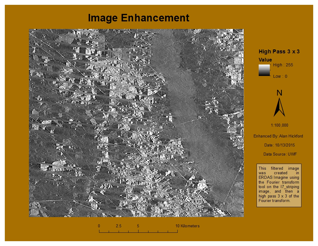
      The third part was the main focus of the lab. We were to take an image and perform an enhancement on it that reduced the effect of the striping in the image, but also retain most of the detail. I performed a Fourier transform on the image using Imagine, which reduced some of the striping. I then used a 3x3 Sharpen kernel on the image to sharpen the features. I really enjoyed working with the Fourier transform tool. I have seen it used in statistics and research, but never actually worked with it before (outside of mathematics). It wasn't too complicated to perform the transformation with Imagine, and I used it in my final enhancement image. I created multiple enhancements using various techniques as I tried to determine which worked best for this image. I started with a 5x5 low pass enhancement, which made the image quite a bit more blurry as expected. I tried a Sobel 3x3 edge enhancement, which did leave most of the detail intact but also left the striping. I tried a 3x3 horizontal kernel, which distorted the image and made it grainy. I also tried a 5x5 Summary, which wasn't too bad; again, it left the detail but also the striping. What I finally did was to use a Fourier transform but with a larger circle. The smaller the circle here, the more pronounced the low pass filter will be, and the image would be blurry. A larger circle mitigated that effect. From here, I used a 3x3 high pass filter, which gave a detailed image while also reducing the effect the striping has on the image. From there, I added the image into ArcMap and created my map. I wanted to show the image at 1:100,000 scale so that the effects of the enhancements can be seen.


Sunday, September 27, 2015

Lab 5a - Intro to ERDAS Imagine and Digital Data 1

This lab was primarily an introduction to the ERDAS Imagine software and using it to perform some basic photo interpretation tasks. The first part of the lab was to perform some calculations using Maxwell's wave theory and the Planck relation to answer some questions about various spectral regions in the electromagnetic spectrum. The second part of the lab was some introduction to ERDAS Imagine. Some tasks performed were displaying data in the data viewer, learning some of the settings allowed within the software, and navigating an image. Navigating an image was rather interesting for me. When using the Pan tool, the program would lock into the Pan mode and just kept panning slowly. Nothing I did got me out of it and the program would not respond. However, when panning by clicking the middle mouse button, it worked just fine, so I will continue panning using that method. We learned how to have a second viewer and to compare different bands of the same image to distinguish certain features. I thought the ease of changing which layer corresponded to the green, red, and blue bands in the Multispectral tab was very useful, and I'm sure I'll use that in the future. I'll probably have to look back at notes at first to recall which type of band combination I want to use to distinguish different features, such as snow, mountains, vegetation type, etc.
The third part was to create a map using a classified image of forested lands in Washington state. I added the data to the ERDAS Imagine viewer and added an area column to the attribute table. One thing I really like about this program is the Inquire Box to select an area to export. Expanding the box by clicking the corner of it and moving it by clicking inside it is very intuitive, and creating a subset image and exporting it was straightforward as well. After creating the subset image, I opened ArcMap and simply added it using the Add Data button. At this point, creating a map was a matter of changing the symbology and description to what I desired (in this case, the forested land classification and area) and adding the essential map elements. Below is my map.


This is a map of some forested lands in Washington state, which displays the various forested land type classifications and the area in hectares. The vegetation is displayed in various shades of green, the bare ground and clouds in beige shades, and water in blue.

Monday, September 21, 2015

Lab 4 - Ground Truthing and Accuracy Assessment

In this lab, we investigated our LULC map from last week to assess our classification schemes and determine our skills of aerial photo interpretation. As we obviously could not visit Pascagoula, Mississippi to actually verify our classification, so we used Google Maps instead. I created a new shapefile for which there are fields for the old classification, the new classification, and whether or not they match. I used the Editor tool to create 30 new points, relatively evenly spaced throughout the map and ensuring there was at least one point for every classification type. Then I used Google Maps zoom feature and the Street View feature to match the location of my points to Google Maps in order to confirm the actual land use/land cover classification type. Once I did this, I calculated the percent of sample points that are correct. To calculate the accuracy, I divided the # of correct points by the total # of points and multiplied by 100 to get an accuracy percent. In this case, the original land use/land cover classification scheme is 53% accurate. The new map is shown below. The green points are those correctly classified in the original scheme and the red points were those incorrectly classified. The original classification was performed using only aerial imagery, so distinguishing between similar classification type proved especially difficult (i.e. deciduous vs. evergreen forest or commercial vs. industrial buildings), and this seems to be where most of the inaccuracies were.


Tuesday, September 15, 2015

Lab 3 - Land Use / Land Cover Classification Mapping

This lab gave us more experience with recognizing ground features using a true color aerial photograph. For this assignment, we were to digitize an area of Pascagoula, MS, and create a land use/land cover map using the USGS Standard Land Use / Land Cover Classification System. For this assignment, classifying the map up to Level 2 was fine.

First I added the aerial photograph and created a new shapefile, adding 2 fields: one for the two digit code and one for the code description. My main focus when attempting to select areas to digitize was to stay consistent. I used the Editor tool to draw the polygons and add their classifications to the new LULC shapefile. I started with features that were easier to identify and had a more clear starting and ending point; for example, deciduous forest areas surrounded by residential or commercial areas. I started with the forest areas, then moved on to the wetland areas, especially the islands on the west side of the map. The water was easy to identify but tough to classify as the streams meandered and the wetlands were sometimes in the way. Houses have a rather distinctive shape and size and they tend to be clustered into neighborhoods, so they were not difficult to identify. Commercial and industrial buildings were sometimes difficult to set apart, but I figured that commercial buildings are more likely to be nearer residential structures than industrial buildings are. Both, however, tended to be larger and more square or rectangular than houses. Barren land was usually somewhat easy to determine, although the level 2 portion of the barren land category was sometimes difficult to distinguish. I also was running into a bit of a time issue with this one, so later I was not focused on getting every tiny little curve and nuance correct with some of the digitization, but I made sure not to be too inaccurate with it. This was an interesting but time-consuming assignment, and it gives me a whole new respect for those land cover or land use maps we sometimes download as a layer to use in an analysis. Below is my land use / land cover map of Pascagoula, MS.


Tuesday, September 8, 2015

Module 2 - Visual Interpretation

In this lab, we learned to interpret figures in aerial photos using several criteria: tone, texture, shape and size, shadow, pattern, and association. We also compared true color vs. false color (near-infrared) imagery.

First, we wanted to identify features on a photo based on tone and texture. I used the drawing tool in ArcMap to create polygons that enclosed areas of different tones, ranging from Very Dark to Very Light. I then created polygons enclosing areas of different textures, ranging from Very Coarse to Very Fine. The objective here was to determine what type of feature would show up as what tone or texture. For example, a group of houses displays as a very coarse texture as they are spread out, where water is a very fine texture. Below is my map layout identifying features based on tone and texture.


Next we wanted to identify features based on four criteria: shape and size, shadow, pattern, and association. Shape and size define what an object looks like, such as in my map, one of the buildings labeled "looks like" a house. Shadows are an interesting resource when identifying features. They can be a help or hindrance. Some can hinder where they block out other features, but they are often invaluable in determining the extent or height of a tall object, especially if it's narrow and hard to see otherwise. Pattern is used to identify groups of objects that seem insignificant individually but make up a larger feature. One good example is if you are attempting to identify farmland based on crops grown there. Association is a tricky criterion. This is used when a feature could have a variety of uses, but you identify it or narrow down the options by associating it with something nearby. There are examples of all these criteria used to identify features in the map below.


Finally, we wanted to compare a true color photo to a false color or near-infrared (NIR) photo. I examined features that I could identify by their color in the true color photo and compared the color to that of the NIR photo. The most obvious difference was in the vegetation. They appear green in the true color and red in the NIR photo because plants reflect more NIR radiation. This is seen clearly when looking at the mixed pine forests southwest of the river. The fairways and greens of the golf course also show this clearly. Clear water appears black but water with sediment in it appears blue in the NIR photo because it is reflecting visible light, which explains why the river and marshland are blue and bluish-green in the NIR photo. The concrete bridge and sandy, bare earth areas don't look much different between the two photos.

This was a really interesting lab, and more challenging than it appears, as I do not have a lot of practice identifying features from aerial photography. It is a good skill to have though. I look forward to the next module.