The objective of this lab was to learn to use ArcGIS to perform dasymetric mapping, which is a technique for allocating data from one set of boundaries to another. In this lab we learn to use a common example in which data is allocated from census units to another set of boundaries, in this case school zones. We start by calculating an estimate of high school students population based on the population of children aged 5-14 by using areal weighting, and then do the same analysis using dasymetric mapping.
First, we are provided with county and census block data, as well as data for the Manatee river basin. We quickly see that some of the census blocks are partially within and outside the river basin, but we want the population just of the river basin. To do this, we use areal weighting. An assumption made is that population is distributed evenly within each block group. Areal weighting is basically taking the population of a census block and, using the percentage of that block within the river basin, calculating the population of that block that is within the basin. For example, a block 30% within the basin with a population of 200 will have a new population of 60 within the basin.
In the second part of the lab, I started working with the data to be used the rest of the lab. The objective was to used the population aged 5-14 to predict the upcoming high school attendance. Our data layers are census tracts, water polygons, and high school boundaries. We can assume that the population is equally distributed in areas outside the water polygons. The trick here was determining the area before and after the polygons are joined. Before any overlay is done, I added a field for area and calculated the area of each census block. Then I clipped both the high schools layer and the hydro layer to the extent of the census blocks. I also clipped the hydro clip and the original census layers to the extent of the high school clip in an attempt to avoid "slivers", which could affect my population estimate. I used the Union tool to combine all 3 layers, created a new area field, and calculated the area. Next I created 4 new population fields (one for each original population field) and used the equation provided to calculate the new population. The equation is:
new population = original population * (area after / area before).
So this is simply an adjustment in the population based on the ratio of the area within the school zones. To calculate the error, I used provided reference population values and compared them to values determined by my areal weighted estimate. To calculate the overall accuracy, I used the equation:
Sum of Abs(Error) / Sum (reference population) * 100.
Based on this, the total % of people aged 5-14 allocated incorrectly was 11.6%.
In the next portion of the lab, we were to use dasymetric mapping to see if we could decrease the % allocated incorrectly. To me, this was a very confusing concept, but I think I have the concept (if not the correct values) at the end. In addition to the data from the previous section, we are provided with a 30 m x 30 m raster of imperviousness values. Impervious objects are objects that are covered by impervious features (i.e. concrete, asphalt, etc). Generally as the % imperviousness increases, so does the population, so we can use this as ancillary data to try to better predict the high school populations. Based both on what is said in this lab and on reading papers about it, we can safely assume a linear relationship between imperviousness and population. I knew that I wanted to do the same type of calculation as with the areal weighting, but was not sure for the longest time how to determine the new imperviousness. Using the Zonal Statistics as Table tool, I was able to obtain the information I needed from the imperviousness raster, specifically the Count, the Mean, and the Sum. After joining this with the census data, the count value is the number of pixels in that tract, the mean is the average imperviousness per census tract, and the sum is the mean * count. I performed an intersect using this layer and the high schools layer, which is where I was stuck for a while. I finally realized that since the census tracts are getting broken up into school zones, wherever they don't "fit" perfectly (where portions of a census block are in multiple school zones), I have multiple values for that census tract. To determine the new imperviousness, I selected each census block and calculated the new imperviousness by dividing the original imperviousness by the number of school zones each is broken up into. Based on that, I was able to calculate the imperviousness weighted estimate using the equation:
new population = original population (new imperviousness / original imperviousness).
After calculating my overall accuracy, using imperviousness leads to a misallocation of students of 11.9%. I am questioning these results however, because I believe that imperviouness should reduce the % misallocation of population. It is possible my methodology or math is incorrect as this was a complicated topic, and I'm still not sure I fully understand its application. It took a lot of trying different kinds of overlay before I figured out the correct methodology. Based on my results, it appeared that the imperviousness definitely reduces the % of incorrectly allocated students in school zones that have larger census blocks in them, especially if the tracts are broken up less by the school zones.
Monday, December 7, 2015
Friday, December 4, 2015
GIS Portfolio
As one of our final assignments for the GIS certification program, we were tasked with creating a GIS Portfolio, which is uploaded here. Additionally, I have created an audio portfolio, also uploaded here. I feel that throughout the coursework, I have a better understanding of how to create a map, considering what I am trying to convey to the map reader. I also learned how to use various color schemes and symbologies effectively and how to use different types of input (shapefiles, aerial imagery, satellite data) to create effective maps. I learned a lot during the course of this certification program and feel prepared to use these techniques throughout my career.
GIS Portfolio (PDF)
https://drive.google.com/file/d/0B6JDrUuVfdOhSGhZUVFnZ0dGSjA/view?usp=sharing
GIS Portfolio (Audio)
https://drive.google.com/file/d/0B6JDrUuVfdOhTmZOYjZhOVJhLUk/view?usp=sharing
GIS Portfolio (PDF)
https://drive.google.com/file/d/0B6JDrUuVfdOhSGhZUVFnZ0dGSjA/view?usp=sharing
GIS Portfolio (Audio)
https://drive.google.com/file/d/0B6JDrUuVfdOhTmZOYjZhOVJhLUk/view?usp=sharing
Monday, November 30, 2015
Lab 14 - Spatial Data Aggregation
The main objective of this lab was to become familiar with the Modifiable Area Unit Problem (MAUP), to analyze relationships between variables for multiple geographic units, and to examine political redistricting, keeping the MAUP in mind.
The MAUP is impacted by two components: the scale effect and the zonation effect. The scale effect is attributed to the variation in numerical results owing strictly to the number of areal units used in the analysis. The zonation effect is attributed to the variation in numerical results owing strictly to the manner in which a larger number of smaller areal units are grouped into a smaller number of larger areal units.
First, we were to examine the relationship between poverty and race using different geographic units, ranging from large numbers of small in area units (original block groups) to small numbers of units large in geographic area (House voting districts and counties). After doing this, the general pattern was that lower poverty percentages correlated with a small percentage of non-white residents. As the percentage of non-white residents, the poverty level tended to increase. As discussed in the lecture and readings, the correlation increased with smaller sample size as demonstrated by the increase in the R-square values. Not only can the number of polygons change the results, but also the area that each polygon covers can change the numerical results when comparing the census variables. The key to minimizing the impact of the MAUP on any analysis is to be consistent both in the geographical size and the number of areal units used.
Next we investigated the MAUP in the context of gerrymandering, which is to manipulate district boundaries in order to favor one political party or another. We wanted to determine which existing congressional districts deviate from an ideal boundary (i.e. which have been drawn in the context of gerrymandering the most) based on two criteria: 1) Compactness, i.e. minimizing bizarre shaped legislative districts, and 2) Community, i.e. minimizing dividing counties into multiple districts.
To measure compactness, I found a “compactness ratio” online that describes
compactness as the area divided by the square of the perimeter. After doing
this in ArcGIS, I see that values with a higher compactness ratio are districts
that have a more geometric shape (i.e. rectangles and squares) and those with
lower values are abnormally shaped districts. The compactness ratio seems to be
a 2D version of the isoperimetric inequality, which is a geometric inequality
relating the square of the circumference of a closed curve in a plane and the
area of the plane it encloses. Larger ratio values describe a smooth or
contiguous shape. For example, the rectangular state of Wyoming appears to be
one congressional district and has one of the highest values for “compactness
ratio”. An example of one of the "least compact" districts seen below.
As you can see, this district is a bizarre shape. It's very long and skinny and has a lot of curves, kinks, and strangely shaped boundaries.
To measure community, I want to find areas in which one district encompasses an
entire county, not necessarily only that county, but we want counties that are
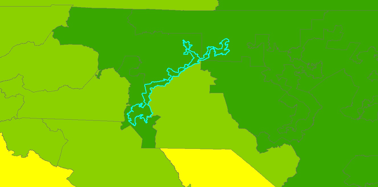
not broken up by congressional district boundaries. I had trouble with this part, as I was able to determine the number of districts within each county using a union and a spatial join, which shows the extent to which some counties are broken up into several districts, but I'm not sure this is the entire answer. Below is an image of Los Angeles County, CA, the county with the most congressional districts (24).

Friday, November 27, 2015
GIS Day Activities
I was working at my internship location as well as at least one other person in the internship program and did not get to attend a GIS day event. I don't think there were any nearby anyway. I was able, however, to lead a discussion/presentation on the current progress of the GIS project that I am doing. For the state of Arizona, I have merged crop data (location, type of crop, type of irrigation) provided by the USGS into one large dataset, to which I have added the temperature that a crop will be damaged due to a freeze (heat damage temperature is also in the dataset). The objective is to create a risk assessment that eventually can be used as part of a National Weather Service forecast. Hopefully, once a working model is developed, the idea can be pushed up the hierarchy to the regional or national level. We have had some issues getting it to work with using the proper coordinate system, but actually QGIS handles this problem better than ArcGIS, surprisingly. Additionally, we want to go that route anyway, as many don't have an ESRI ArcGIS license (too expensive and QGIS is free). The presentation on GIS Day detailed some of that and I found that the merged dataset is really helpful to the USGS community as well, as they do not have all this data in one place, which also surprised me. The data I added to their dataset (the crop temperature and rainfall needed data) came from USGS and a website I found called EcoCrop, originally developed by the Food and Agriculture Organization (FAO) of the United States. The location of crops was originally determined via satellite imagery and later double-checked by USGS personnel on the ground. People seem to be pleased with the progress made so far, and it will be up to the rest of the team to finish getting the temperature data loading properly with QGIS to finish up the risk assessment project.
Monday, November 23, 2015
Lab 13 - Effects of Scale
This lab introduced us to the effects of scale and resolution on spatial data properties. In the first part of the lab, we investigate vector data (hydro features) and in the second part we do this for raster data (elevation models).
Working with the vector data, we were provided with flow lines and water bodies at 3 different scales and at resolutions. After determining the total lengths of the lines at the 3 scales and the information about the water bodies polygons, I determined that basically, the smaller the scale, the more geographic extent is shown, but in less detail. It makes a bit more sense to me to think of it in representative fractions than verbally. 1:1200 means 1 inch on a map represents 1200 inches in the real world. You can get more detail on that than a 1:100000 map with 1 inch representing 100000 inches. I also found it interesting how the lengths, area, and perimeter of our spatial data changed with the change of scale.
In the second part of the lab, we investigated the effects of resolution on raster data. Using the original 1 m LiDAR data, we needed to resample it to create DEMs with different resolutions by changing the cell size. Determining the best resampling technique took some thought. I chose based on the type of data it is and the method I thought would maintain the elevation and slope characteristics the best. I thought the most interesting part of this was starting with the original 1 m LiDAR DEM and resampling the data to change the cell sizes, and watching the DEM have less and less detail as the cell size increased. Using the 90 m LiDAR DEM I created and the SRTM 90 m DEM I projected, I wanted to compare them in terms of their elevation values and derivatives. For this, I mainly followed the example in the S Kienzle (2004) paper, "The effect of DEM raster resolution on first order, second order and compound terrain derivatives." I investigated the difference in elevation between the two DEMs, the slope (first order derivative), the aspect (first order derivative), the profile and plan curvatures (second order derivatives), and the combined curvature (compound derivative, a combination of the second order derivatives). I'm used to the mathematical definition of derivative, which is a slope of a curve (geometric) or a rate of change (physical), and both uses are really seen here. This is why the curvatures made sense to me as the rate of change of the slope (the second derivative).
Before I got to the results, I needed to recall how the LiDAR and the SRTM DEMs were created. SRTM elevation data is created using synthetic aperture radar (SAR). This uses two radar images and uses the phase difference measurements with a small base to height ratio to measure topography. Wavelengths in the cm to m range are very accurate as most of the signal is bounced back. Heavily vegetated areas may not allow the radar to penetrate enough to get accurate elevation values and very smooth surfaces such as water may scatter the radar beam so elevation values can be inaccurate or unobtainable. LiDAR elevation data is created by an aircraft flying overhead transmitting a signal to the ground and determining the time it takes for the signal to be bounced back to the transmitter, which is then used to calculate an elevation value. LiDAR also has problems in heavily vegetated areas, but there are usually enough data points to interpolate pretty accurate elevation values. Additionally, there can be up to 5 returns per pulse, so this handles rougher and heavily vegetated areas better than SRTM does.
I used ArcGIS to create the slope, aspect, and curvature layers, which I then visually compared. Based on the way the slope is flatter where the streams are but how it quickly becomes steep on either side of the stream, it seems to me this could be an area where a stream cuts through a canyon before reaching the outlet. The SRTM DEM tended to have elevation values that were higher than those of the LiDAR DEM in lower elevations (streams) and lower values in higher elevations, so the mean slope of the SRTM DEM was less than that of the LiDAR DEM. I used other images to analyze the data as well, but below is a screenshot of the slope. We can see that the maximum slope of the LiDAR DEM is greater than that of the SRTM DEM.
 I wanted to follow the example in the paper further and compare both to original point data to determine the accuracy of the two DEMs, but I did not have known elevation data. I considered using the 1 m resolution DEM as known data (the paper we read did something similar), but was not sure that would work in this case. Based on what I know about how the LiDAR and SRTM data are obtained, I think that the LiDAR data is likely more accurate, as there are more data points with less distance between them than for the SRTM data. Also, LiDAR does not have the problems over water or heavy canopied vegetation that SRTM data does. The big limitation for both is that due to how they collect data, neither can work effectively through clouds.
Working with the vector data, we were provided with flow lines and water bodies at 3 different scales and at resolutions. After determining the total lengths of the lines at the 3 scales and the information about the water bodies polygons, I determined that basically, the smaller the scale, the more geographic extent is shown, but in less detail. It makes a bit more sense to me to think of it in representative fractions than verbally. 1:1200 means 1 inch on a map represents 1200 inches in the real world. You can get more detail on that than a 1:100000 map with 1 inch representing 100000 inches. I also found it interesting how the lengths, area, and perimeter of our spatial data changed with the change of scale.
In the second part of the lab, we investigated the effects of resolution on raster data. Using the original 1 m LiDAR data, we needed to resample it to create DEMs with different resolutions by changing the cell size. Determining the best resampling technique took some thought. I chose based on the type of data it is and the method I thought would maintain the elevation and slope characteristics the best. I thought the most interesting part of this was starting with the original 1 m LiDAR DEM and resampling the data to change the cell sizes, and watching the DEM have less and less detail as the cell size increased. Using the 90 m LiDAR DEM I created and the SRTM 90 m DEM I projected, I wanted to compare them in terms of their elevation values and derivatives. For this, I mainly followed the example in the S Kienzle (2004) paper, "The effect of DEM raster resolution on first order, second order and compound terrain derivatives." I investigated the difference in elevation between the two DEMs, the slope (first order derivative), the aspect (first order derivative), the profile and plan curvatures (second order derivatives), and the combined curvature (compound derivative, a combination of the second order derivatives). I'm used to the mathematical definition of derivative, which is a slope of a curve (geometric) or a rate of change (physical), and both uses are really seen here. This is why the curvatures made sense to me as the rate of change of the slope (the second derivative).
Before I got to the results, I needed to recall how the LiDAR and the SRTM DEMs were created. SRTM elevation data is created using synthetic aperture radar (SAR). This uses two radar images and uses the phase difference measurements with a small base to height ratio to measure topography. Wavelengths in the cm to m range are very accurate as most of the signal is bounced back. Heavily vegetated areas may not allow the radar to penetrate enough to get accurate elevation values and very smooth surfaces such as water may scatter the radar beam so elevation values can be inaccurate or unobtainable. LiDAR elevation data is created by an aircraft flying overhead transmitting a signal to the ground and determining the time it takes for the signal to be bounced back to the transmitter, which is then used to calculate an elevation value. LiDAR also has problems in heavily vegetated areas, but there are usually enough data points to interpolate pretty accurate elevation values. Additionally, there can be up to 5 returns per pulse, so this handles rougher and heavily vegetated areas better than SRTM does.
I used ArcGIS to create the slope, aspect, and curvature layers, which I then visually compared. Based on the way the slope is flatter where the streams are but how it quickly becomes steep on either side of the stream, it seems to me this could be an area where a stream cuts through a canyon before reaching the outlet. The SRTM DEM tended to have elevation values that were higher than those of the LiDAR DEM in lower elevations (streams) and lower values in higher elevations, so the mean slope of the SRTM DEM was less than that of the LiDAR DEM. I used other images to analyze the data as well, but below is a screenshot of the slope. We can see that the maximum slope of the LiDAR DEM is greater than that of the SRTM DEM.

Monday, November 16, 2015
Lab 12 - Geographically Weighted Regression
This lab is somewhat of an extension of last week's, which dealt with Ordinary Least Squares (OLS) regression. OLS regression is a numeric or non-spatial analysis that predicts values of a dependent variable based on independent, or explanatory, variables. The main thing is that with OLS regression, all the values are given the same weight when predicting the dependent variable's values. This week with Geographically Weighted Regression (GWR), we learned how to perform the same type of analysis, but now the analysis is weighted in that areas that are spatially closer to a particular point for which we are trying to predict are given more weight than areas farther away. GWR allows us to analyze how the relationships between the explanatory variables and the dependent variables change over space.
The first part of the lab has us using the data from last week's lab on OLS and performing a GWR analysis using the same dependent and independent variables. We were then to compare the two analyses to determine which was better. In this case, GWR gave a higher adjusted R-squared value and a lower AIC value, so GWR was better.
In the second part of the lab, we were to complete a regression analysis (both OLS and GWR) for crime data. For the analyses, I needed to select a type of high volume crime, so I chose auto theft. After joining the auto theft and the census tract fields, I added a new Rate field, as crime data statistics are investigated using rates instead of raw counts. I created a correlation matrix with Escel using the 5 independent variables in the lab:
BLACK_PER - Residents of black race as a % of total population
HISP_PER - Residents of Hispanic ethnicity as a % of total population
RENT_PER - Renter occupied housing units as a % of total housing units
MED_INCOME - Median household income ($)
HU_VALUE - Median value of owner occupied housing units ($)
These coefficients are basically a measure of the strength of the linear relationship between that independent variable and our dependent variable, in this case the rate of auto thefts per 10,000 people. Based on the correlation matrix, I chose to use median income, renter occupied housing, and black population percentage as my 3 independent variables. I did not use variables where the correlation coefficient was very nearly 0. I also did not use both variables with negative coefficients, as they were strongly correlated with each other, so I used only the variable that was more strongly negatively correlated with the dependent variable. Using ArcGIS, I performs an OLS analysis and used Moran's I to determine the spatial autocorrelation between the residuals. I ran into an issue here where based on Moran's I, the data was clustered (z-value of over 9). Often that is a sign that not enough independent variables were included in the analysis, so I ran it a couple more times using more and fewer independent variables, but the clustering remained, so I went with my original 3 independent variables based on both the correlation matrix and the statistically significant p-values. The adjusted R-squared value here is much lower than what I am used to seeing from last week and the first part of this lab (0.220) and the OLS had an AIC of 2514.415.
I then performed a GWR analysis using the same dependent and independent variables. There was an improvement in the adjusted R-squared (0.300) and AIC (2471.306) values, but the most dramatic improvement was when I performed Moran's I and found a z-score for residuals of -1.073, which means the data is no longer clustered and is now randomly distributed. I think the adjusted R-squared values are so low because none of the independent variables showed a really strong correlation to the auto theft rate (most of the values were around 0.4 or 0.5). If there isn't a strong correlation, there must be another factor not included in the analysis leading to the auto theft rate.
I'm not necessarily sure that either analysis is the best for predicting the rate of auto thefts, primarily due to the adjusted R-squared values. The best I could manage was 0.300, which means that 30% of the spatial variation in auto thefts per 10,000 people can be explained by the 3 independent variables used. The results were that in the center of the map the observed values of auto theft were higher than the predicted values (over 2.5 standard deviations in a couple of spots), and observed values were slightly lower than predicted a little further west and north of center. Over the rest of the map, the observed and predicted values were very similar. A better result might come from using different or more independent variables (perhaps something similar to distance from urban centers such as in last week's lab), or from a different type of analysis.
Overall, I feel I have a better understanding of what these regression techniques are telling us, and a better idea of what to do to get better results. I feel I understand GWR better than OLS for some reason; maybe it's that the concept of closer objects being more related than objects farther away, which is the basic premise behind GWR, makes sense to me.
Tuesday, November 10, 2015
Lab 10 - Supervised Classification
In this lab, we learned how to perform supervised classification on satellite imagery. We learned to create spectral signatures and AOI features and to produce classified images from satellite data. We also learned to recognize and eliminate spectral confusion between spectral signatures.
In the first part, we learned to use ERDAS Imagine to perform supervised classification of image files. We learned to use Signature Editor and create Areas of Interest (AOIs) in order to classify different land use types. One thing I liked about this was the ability to use the Inquire tool to click on an area where we know the land use type, and then use the Region Growing Properties window at Inquire to select an area matching that land use type, and I found it is more accurate than drawing a polygon signifying a land use type. Adjusting the Euclidean distance to get the best results is somewhat tricky and I could use a little more practice with it, but I think I get the general idea that it signifies the range of digital numbers (DN) away from the seed that will be accepted as part of that category.
We also learned to evaluate signatures histograms to determine if they are spectrally confused, which occurs when one signature contains pixels belonging to more than one feature. To check this in the histogram, we select two or more signatures and compare the values in a single band. If the two signatures overlap, they are spectrally confused, which causes problems when reclassifying the image. We can look at the spectral confusion of all the signatures by viewing the mean plots. If bands are close together, spectral confusion could be a problem.
In Exercise 3, we learned to classify images, and there are various options. In this case, we are using the Maximized Likelihood classification, which is based on the probability that a pixel belongs to a certain class. This process also creates a distance file, which is very interesting, as the brighter pixels signify a greater spectral Euclidean distance. So the brighter the pixel, the more likely that pixel is misclassified, and this helps determine when more signatures are required to obtain a good classification. We also learned to merge the classes, which is basically using the Recode tool that we learned to use last week, in which we merge all like signatures into one signature (i.e. merging 4 residential signatures into 1).
In the final portion of the lab, we are reclassifying land use for the area of Germantown, Maryland in order to track the dramatic increase in land consumption over the last 30 years. Initially, I used the Drawing tool to draw polygons at the Inquire points, but I wasn’t getting a good classification result, so I went to creating the signatures from the “seed” point, using the Inquire point as the seed points. I created the signatures based on the coordinates in the lab and used the histogram to attempt to use bands with little spectral confusion. Based on the histogram and the mean plots, I used bands 5, 4, and 6 for my image. My reclassified image is below.

I ran into some problems after recoding, as the classification is not as accurate as I had hoped. It is evident to me that many of the urban areas are misclassified as either roads or agricultural areas. The areas classified as water are classified well, as surprisingly are the vegetation layers. As they are similar spectrally I anticipated more misclassified vegetation than there are. I think the two land use classifications that are overclassified (where there are more pixels classified that way than actually are present) are roads and agriculture, and I believe that many urban/residential areas are misclassified as agriculture or roads, likely due to the similarities between the spectral signatures (possibly in band 6). I did not have time to add more signatures than detailed in the lab, and I think that would have helped my classification here. Even so, I think supervised classification is an excellent technique, and I'm glad I learned how to use it.
Sunday, November 8, 2015
Lab 11 - Multivariate Regression, Diagnostics and Regression in ArcGIS
In this lab we learned to perform multivariate regression analysis and to work with more advanced diagnostics in ArcGIS. In the first two parts of the lab, we used Excel to perform regression analysis and diagnostics, including choosing the best model for a given dataset. In the last two parts, we performed a regression analysis to test what factors cause the high volume of 911 calls in Portland, OR. First I ran the Ordinary Least Squares tool to determine if population was the only factor affecting the 911 calls. The coefficient of the POP variable is 0.016, so although
this shows a positive relationship in that an increase in population lead to an
increase in 911 calls, the relationship is a weak one, as the coefficient is
low. I expected a positive result in that I expected an increase in population
to lead to an increase in 911 calls, but I expected the relationship to be
stronger. Looking at the Jarque-Bera test, there is a very low probability that
the residuals are normally distributed. This implies that the model is not
properly specified and that more explanatory variables need to be included.
Now that we know that more variables are required for the model, I performed another analysis using 3 variables: Population, Low Education, and Distance to Urban Centers. This model shows that an increase in population or in lower levels of education lead to an increase in 911 calls, and a decrease in the distance from urban centers lead to an increase in 911 calls. The Jacque-Bera is not statistically significant, which means that the data is normally distributed and we are using the correct number of explanatory variables in the model. The VIF for all 3 explanatory variables is between 1 and 2, so the variables are not redundant (I’m not using too many variables). Based on the adjusted R-Squared value, 74% of the variation in the number of 911 calls can be explained by the changes in population, the lower education level, and the distance from urban centers. This is a good model, but how do I know it's the best?
Part D investigates how to determine the best model. This is done using the Exploratory Regression tool. This tool runs a regression analysis on all combinations of the explanatory variables selected, from which we can look at the statistics to determine the best model. In this case, the best model was determined from 4 explanatory variables: Jobs, Low Education, Distance to Urban Centers, and Alcohol. Three of the 4 variables show a positive relationship compared to 911 calls: jobs, low education, and alcohol. The distance to urban centers had a negative relationship compared to 911 calls. The performance of the model is determined partially by the adjusted R-squared value, which is basically a measure of how much of the variation of the dependent variable can be explained by changes in the explanatory variables. Also looked at are the VIF, of which values >7.5 mean that the variables are redundant. The Jacque-Bera statistic is basically a measure of whether or not the residuals are normally distributed. If they are, we have a properly specified model. Another way to tell this is by using the Spatial Correlation (Global Moran's I) tool, which shows a chart displaying whether there is clustering in the residuals or in the correlation is random. If there is clustering, that means that we need to include more variables in the analysis.
Tuesday, November 3, 2015
Module 9 - Unsupervised Classification
In the first part of the lab, we learned to create a classified image in ArcMap from Landsat satellite
imagery using the Iso Cluster tool. This allows us to set the number of
classes, the number of iterations, the minimum class size, and the sample
interval as desired. Using the output from the Iso Cluster tool, we then use
the Maximum Likelihood Classification tool, using the original Landsat image as
the input and the output from the Iso Cluster step as the signature file, and
the new classified image is created. I
assumed at this point we would be done with the unsupervised classification,
but we now need to decide what the new classes represent. At this point, we are
exploring a smaller image than the one we deal with later, with 2 vegetation
classes, one urban, one cleared land, and one mixed urban/sand/barren/smoke.
In the second part of the lab, we learn
to use ERDAS Imagine to perform an unsupervised classification on imagery. I
think it’s a little more complicated in Imagine than in ArcMap. First we perform the
classification using the tool Unsupervised
Classification in the Raster
tab. For this exercise, we choose 50 total classes, 25 total iterations, and a
convergence threshold of 0.950 (basically a 95% accuracy threshold), and we use
true color to view the imagery. Here
is where the lab got a little time-consuming. Now we have an image of 50 different
classes and we want to get it down to 5 (same number as in exercise 1).
Examining the attribute table displays the 50 classes, and we need to pick all
50 classes of pixel and reclassify that into one of our 5 classes (in this
case, trees, grass, urban, mixed, and shadows). The lab suggests we start with
the trees, selecting every pixel that is associated with a tree and change that
to a dark green color and the class name of trees. So, I started with the
trees, then moved to buildings and roads, then to shadows, and finally to grass
and mixed areas. To me, the grass seemed somewhat brown, and there may be quite
a bit of grass labeled as “mixed” in my map due to this. After
all 50 categories were reclassified, I had to Recode the image by selecting the
areas for each category and giving them all the same value (1, 2, 3, 4, or 5). As
there were no pixels labeled as unclassified, I classified that as part of the
“shadows” classification so that it would not display in the legend. Once this
was done, I saved the image and Recoded it. I added class names and an area
column in the attribute table. Finally, we
were asked to calculate the area of the image and to identify permeable and
impermeable surfaces as a percentage of the total on the image. Permeable
surfaces allow water to percolate into the soil to filter out pollutants and
recharge the water table. Impermeable surfaces are solid surfaces that don’t
allow water to penetrate, forcing it to run off. So, I decided that the
buildings/roads are 100% impermeable, the grass and trees are 100% permeable,
and the Mixed and Shadows are 75% permeable and 25% impermeable, which I
determined just from taking a look at the overall image visually. I feel this is a pretty good approximation of land use in and around the UWF campus based on the original imagery. The only thing is as much of the grass seemed more brown than green, I may have classified some of that as "mixed" instead of "grass", but overall this looks pretty good, Below is an image of my final map.

Sunday, November 1, 2015
Lab 10 - Introductory Statistics, Correlation and Bivariate Regression
This week's lab introduced us to introductory statistics, including correlation and bivariate regression. The first part of the lab introduces us to the calculation of simple descriptive statistics using Excel, including median, mean, and standard deviation. We carried out these calculations for 3 different data sets. The second part of the lab introduced us to correlation coefficients. First, we computed this and created a scatterplot of age vs. systolic blood pressure. We also computed the correlation between various demographics for the southeastern United States. I found a strong positive correlation between the % of adults diagnosed as obese and those diagnosed as diabetes, which is a well-known correlation. In Part C we learned to perform bivariate regression. I calculated the intercept and slope and performed a regression analysis using the data analysis tab in Excel. I learned to use the adjusted R-squared value and the p-value for the slope to determine if the relationship is significant. The adjusted R-squared value is basically how well the data fits a regression line. The p-value is a test of whether the null hypothesis that the coefficient is zero can be rejected; the null hypothesis being zero means that the relationship is not significant. A low p-value means that the null hypothesis can be rejected and the relationship between the two variables is significant.
Next we had a time series of annual precipitation for two stations. Over the period of 1950 to 2004 data was available for both stations, but data for station A was missing for the period 1931 to 1949. Our objective was to use regression analysis to estimate the missing precipitation values. I created a scatterplot for the two stations from 1950 to 2004, and performed a bivariate regression analysis using the Data Analysis tool in Excel. Using the slope and the intercept coefficient values, I was able to use the regression formula of y = ax + b, where a is the slope, b is the intercept, and y and x are the annual precipitation values of the two stations. I wanted to solve for x, so from the initial equation:
y - b = ax --> x = (y - b) / a; I used this equation in Excel to calculate the missing annual precipitation values for station A.
Obviously, working for the National Weather Service, we could not use these values as "official" values. The assumptions here are mainly that the missing data will fit the regression line exactly and that the relationship between the two stations was the same between 1931 and 1949, which most likely was not the case. However, it is most likely a reasonable approximation based on the rest of the data.
Tuesday, October 27, 2015
Lab 8 - Thermal and Multispectral Analysis
In this lab, we learn to interpret radiant energy, to create composite multispectral imagery in both ERDAS Imagine and ArcMap. We also learn to change band combinations, and we further investigate adjusting imagery by adjusting breakpoints.
This
exercise demonstrates the basic principles of thermal energy and radiative
properties, specifically the concepts associated with Wien’s Law and the
Stefan-Boltzmann Law. The radiant energy is proportional to the fourth power of
an object’s temperature, so the Sun emits more radiant energy than the Earth.
We also see that the energy peak moves to shorter wavelengths as the
temperature increases. This is why we call incoming solar radiation “shortwave”
radiation and outgoing terrestrial radiation as “longwave” radiation.
.
The second exercise of the lab is a really good introduction to combining multiple layers into a single image
file both by using Layer Stack in ERDAS and Composite Bands in Arcmap. As pointed out in the lab, it is much quicker
and easier in Arcmap, but it’s good to know how to do this in ERDAS as well.
. We also learned to analyze the image, both in panchromatic and multispectral bands, and
manipulated the different spectral bands being displayed by manipulating the
breakpoints to better distinguish certain features. We saw the difference
between images taken in winter versus images taken in summer by looking at the
thermal infrared band. It’s really interesting to see the diurnal pattern and
the differences in specific heat capacity, with features that heat up quickly
during the day also cooling quickly at night or in winter.
The final portion of the lab tasked us with displaying different bands of multispectral imagery I
decided to use the Pensacola composite image and to identify urban features. I
still am learning how to adjust breakpoints, but this part gave me a lot of
practice with it. I also used a lot of trial and error regarding which bands of
the imagery would best display the feature that I wanted, which was rather
tricky. Often, the urban areas were not displayed well; they were usually too
light and although you could see the general area, you couldn’t really distinguish
any features. Using the bands I chose, there is good contrast between the urban
areas and adjacent areas, such as the water and the vegetation, and the urban
areas are pretty well defined. Below is my image of Pensacola. The feature I wanted to identify was the urban areas, and they are clearly defined as the pink/lavender area, mainly west of the river that runs north-south through the middle of the image. For this image, I am displayed bands 1, 4, and 6. Band 1 shows blue wavelengths, and is often used to display man-made features. Adjusting the breakpoints of this band made the image clearer. Band 4, or near-IR, is often used to identify vegetation, but here after adjusting breakpoints to limit the amount of red in the image, the urban areas stood out. The band that completes the image is band 6, which is thermal IR. Urban areas are often warmer than surrounding areas, and that is the case here. Additionally, with the thermal IR layer, you can clearly see the fire in the far northeast portion of the image.

Sunday, October 25, 2015
Lab 9 - Accuracy of DEMs
The objective of this assignment was to calculate and analyze the vertical accuracy of a DEM, comparing it to known reference points. We also analyzed the effects of interpolation methods on DEM accuracy.
First, we are given a high resolution DEM obtained through LIDAR and reference elevation points collected on the ground. Field data was collected for 5 land cover types: a) bare earth and low grass, b) high grass, weeds, and crops, c) brush lands and low trees, d) fully forested, and e) urban areas. Cluster sampling was used, which are
selected by a random or systematic method with a cluster of samples around each
center. The main way to spot cluster sampling is that the distances between
samples are smaller than the distance between clusters.
One of the best ways to determine the quality of a DEM is to
take the DEM data and compare it to some form of reference data. Here we used elevation
points obtained from the field. Using that data, we can determine the root mean
square error (RMSE), the 68th percentile accuracy and the 95th
percentile accuracy. Low values there generally means that the DEM data matches
up well with the reference data and the values are accurate. You can also
calculate the mean error to help determine the vertical bias. The reason RMSE
does not work for this is that the elevation difference between the DEM and
reference values are squared within the calculation, so the result is always positive;
you cannot determine bias from RMSE. From my results, this is a very accurate
DEM, with an overall RMSE of 0.276 meters and a 95% confidence level of 0.43
meters. It seems to be the most accurate over bare earth and low grass and less
accurate over shrubland and low trees (perhaps it’s easier to distinguish between
taller trees and the ground than shrubs and the ground). The vertical bias is
also very small, with a combined vertical bias of 0.006 meters. The greatest
vertical bias is a 0.16 m negative bias over urban areas and a positive 0.10 m
bias over brush land and low trees. The LIDAR data seems to be an excellent
model of elevation here, and it does exceptionally well over flatter (less “rough”)
areas, such as bare earth or low grass.
Next we are provided a data layer contained 95% of the total points, which are used to create DEMs using 3 interpolation methods: IDW, Spline, and Kriging. The remaining 5% of the points are used as reference points. After creating the 3 DEMs, I exported the reference data to an Excel file and created new columns for the DEM data. After inputting the data to the Excel file, I performed the RMSE, 68th and 95th percentile, and mean error calculations for the three DEMs. Based on these calculations and assuming that I want the interpolation elevation values to be the closest to the reference points, the best interpolation technique for this particular data set is the IDW interpolation.
|
Statistic
|
IDW
|
Spline
|
Kriging
|
|
RMSE (m)
|
11.78366
|
17.78546
|
12.11856
|
|
95th
|
21.72756
|
20.04868
|
22.60116
|
|
68th
|
12.18899
|
9.888262
|
12.41265
|
|
ME (m)
|
1.73996
|
0.854330
|
2.121384
|
Overall, I learned a lot about the process of determining the vertical accuracy of DEMs using reference points. I initially had some difficulty figuring out how to determine the 68th and 95th percentile accuracies, but going back to a previous lab helped with that.
Sunday, October 18, 2015
Lab 8 - Surface Interpolation
In this lab we learned to use ArcMap to carry out and interpret various surface interpolation techniques, including Thiessen, IDW, and Spline.
First, I used given elevation points with interpolation techniques to create a DEM using the Spatial Analyst toolbar in ArcMap. The two techniques used were the IDW method and the Tension Spline method. I wanted to see the differences between the two methods so I used the Raster Calculator to subtract the values of the DEM spline grid from those from the DEM IDW grid. The map layout is seen below.

The areas in the brightest red shows areas where the results of the IDW technique show an elevation nearly 40 m greater than those of the Spline method, and the brightest green shows where the Spline method is nearly 40 m greater than the results of the IDW method. When looking at the values of the elevation points, which are about 425 m, I can see that some of the differences between the results approach 10% of the total elevation, which definitely should affect the DEM.
In the second part of the lab, I wanted to use various spatial interpolation techniques to determine which worked best on water quality data for Tampa Bay. Technique 1 was a non-spatial technique, where I used the Statistics tool on the data points. Technique 2 is Thiessen interpolation, which assigns each location the same value as the nearest point. In ArcMap I used the Create Thiessen polygons tool, converted it to a raster, and used the Zonal Statistics tool to determine spatial statistics.I wouldn't use this technique in this case as I'm pretty sure water quality in unsampled locations is not necessarily the same as at the sampled locations; the data is not that densely sampled. Technique 3 was IDW and technique 4 was spline interpolation. As IDW estimates cell values by averaging the values of sample points in the neighborhood of each processing cell, this method works better with densely sampled data, and seemed to work well with the water quality data. Spline interpolation minimizes overall curvature and results in a smooth surface passing through the sample points, and this worked fairly well for the water quality data once it was modified. The spline technique originally resulted in abnormally high maximas and minima with negative values. Much of this was due to some data points that were very close in proximity to each other had largely different values, which caused abnormally high and low extremes nearby. Once this data was modified, the spline interpolation worked well. As far as which interpolation technique, to me it would depend partially on if I knew whether or not the maximum and minimum values were included in my sample points. If I knew they were or if the data was densely sampled, I would go with IDW interpolation as it is an exact interpolator and will not result in values outside the sampled maximum and minimum. Spline interpolation is not an exact interpolator, so if I'm not sure the maximum and minimum have been sampled or if the data is not densely sampled, I would consider using spline interpolation.
Tuesday, October 13, 2015
Lab 6 - Image Enhancement
In this lab, we learned three main concepts. First, we learned to download and import satellite imagery into ERDAS Imagine and ArcMap. We also learned how to perform spatial enhancements using both of the mentioned software programs, and we learned to use Imagine to perform Fourier transformations.
First, we learned to obtain satellite imagery and how the files are named on the glovis.usgs.gov website. It’s pretty straightforward, with the names following a Sensor type, Path and Row number, and date in the form of year and the Julian date. Of course, other sources of data may have different methods of naming the data files.

First, we learned to obtain satellite imagery and how the files are named on the glovis.usgs.gov website. It’s pretty straightforward, with the names following a Sensor type, Path and Row number, and date in the form of year and the Julian date. Of course, other sources of data may have different methods of naming the data files.
We
also learned how to unzip these specific types of files, which are downloaded
in a *.tar.gz format. I use this type of file quite often, and this is fairly simple to unzip, you just use the 7-Zip
software on the file twice.
The second part of the lab involved learning about different types of spatial enhancement in both Imagine and ArcGIS. I found this really interesting because it gave me a better understanding of what exactly occurs when you use a high or low pass filter. It's used a lot when performing research in meteorology, so I already had a basic understanding of it, but this lab explains it well and is very useful, especially seeing the calculations being performed when using the filters.
We learned about high pass filters, which allow high frequency data (data that changes rapidly from pixel to pixel) to pass through, but suppresses low frequency date (data that doesn't change much from pixel to pixel). This has the effect of enhancing edges or discrete features, or to sharpen an image. We also learned about low pass filters, which allow low frequency data but suppress high frequency data, which has the effect of blurring or "smoothing" an image. I also learned how to use the Focal Statistics tool in ArcMap, specifically the "Mean" and "Range" filters. The Mean filter is a low pass filter, but it uses as 7x7 kernel instead of a 3x3 kernel, which results in each new cell being the average of a larger area, so the result is a more generalized image. I immediately thought in terms of resolution -- the results from the 7x7 kernel having a more coarse resolution than those from the 3x3 kernel. The Range statistic is similar to Edge Detect, It gives each new cell a value showing the difference in brightness between neighboring pixels, which is called spatial frequency. So, if you have a border or an edge, the spatial frequency will be high and it will show up brighter on imagery. The interiors of an area will be darker as they will have a lower spatial frequency due to the similarity of the surrounding pixels.
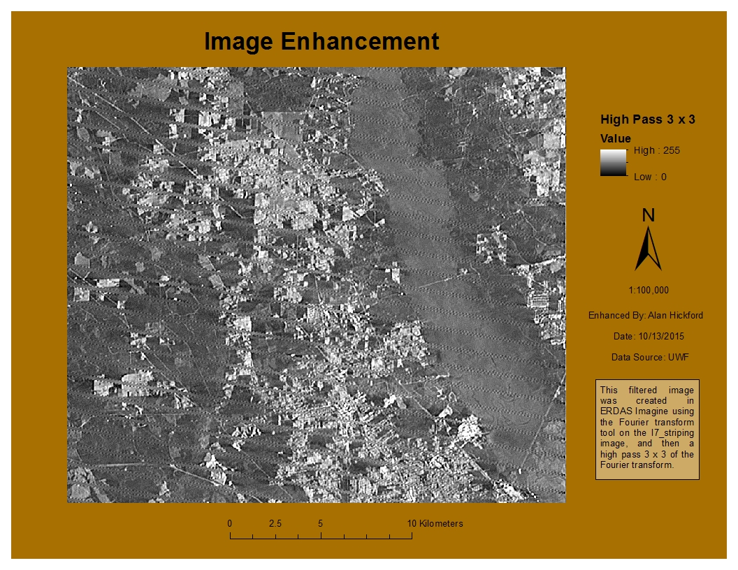
The third part was the main focus of the lab. We were to take an image and perform an enhancement on it that reduced the effect of the striping in the image, but also retain most of the detail. I performed a Fourier transform on the image using Imagine, which reduced some of the striping. I then used a 3x3 Sharpen kernel on the image to sharpen the features. I really enjoyed working with the Fourier transform tool. I have seen it used in statistics and research, but never actually worked with it before (outside of mathematics). It wasn't too complicated to perform the transformation with Imagine, and I used it in my final enhancement image. I created multiple enhancements using various techniques as I tried to determine which worked best for this image. I started with a 5x5 low pass enhancement, which made the image quite a bit more blurry as expected. I tried a Sobel 3x3 edge enhancement, which did leave most of the detail intact but also left the striping. I tried a 3x3 horizontal kernel, which distorted the image and made it grainy. I also tried a 5x5 Summary, which wasn't too bad; again, it left the detail but also the striping. What I finally did was to use a Fourier transform but with a larger circle. The smaller the circle here, the more pronounced the low pass filter will be, and the image would be blurry. A larger circle mitigated that effect. From here, I used a 3x3 high pass filter, which gave a detailed image while also reducing the effect the striping has on the image. From there, I added the image into ArcMap and created my map. I wanted to show the image at 1:100,000 scale so that the effects of the enhancements can be seen.
Sunday, October 11, 2015
Lab 7 - TINs and DEMs
The objective of this lab was to learn the difference between TIN and DEM elevation models, as well as examine some of their properties. The first part of the lab was to drape an image over a terrain surface. I was provided a TIN elevation model and a satellite radar image showing the land surface roughness. Using ArcScene, I added both layers and saw that since the image has a base elevation of 0, it is hidden by the terrain surface. Using the base heights tab, I chose to float the image over the terrain surface, and I was now able to see the whole scene. To get a better idea of the elevation changes, I used vertical exaggeration.
In the second part, I used a DEM to develop a ski resort suitability model. I had 3 categories to reclassify in terms of which got the most snow: elevation, slope, and aspect. After reclassifying the categories as described in the lab, I used the Weighted Overlay tool to create a suitability raster with the following weights: 25% aspect, 40% elevation, and 35% slope. I added an exaggeration factor to show the elevation changes a little better and used lighting effects.
The next portion of the lab allowed us to explore TINs in some more detail. The first thing we did was look at different visualization options, including elevation, slope, aspect, and nodes options. Next we created and analyzed TINs, comparing them to DEMs. The nice thing about TINs is that to see contours, one only needs to modify the symbology, whereas with the DEM one needs to use the Contour tool. Basically, a DEM is a better option with continuous grid spacing, where a TIN is good with data that has higher and lower density grid points. When investigating the elevation data, both models seem to do a good job, with the DEM doing a little better with the smaller details toward the edges of the map where there are fewer grid points. Below are two screenshots of the DEM contours and the TIN contours:
TIN contours:

DEM contours:

TINs derived from elevation points or contours don't necessarily display sharp boundaries such as streams or lakes well. So we learned to modify TINs to better define those sharper boundaries. I loaded the TIN and the lake shapefile, changing the offset of the lake layer so that it would just show up on top of the TIN. Using the edit TIN tool, the lake boundaries were changed to hard breaklines so that the TIN was forced to use the exact boundaries and elevation of the lake polygon.
Overall, I found this to be an excellent lab in learning not only what a TIN is, but also when to use a TIN vs. a DEM.
Sunday, October 4, 2015
Lab 6 - Location-Allocation Modeling
This week's assignment was designed to familiarize us with using network analysis to locate best facilities and allocate demand to those facilities. In the first part, we were tasked with working through a tutorial familiarizing us with the concept of location allocation.
In the second part, we were to perform a location allocation analysis with the Minimize Impedance problem to adjust the assignment of market areas serviced by multiple distribution centers for a trucking company. In this scenario, the trucking company has divided the country into several market areas. Our job was to use location allocation analysis to optimize which distribution centers service which market areas. We were provided with a layer showing 22 distribution centers, another layer for customers, a network dataset, and a layer showing unassigned market areas, which is used during the analysis.
At the beginning of the analysis, I set the FacilityType to have a default value of Required. This forces the analysis to use all the distribution centers. I set the impedance to miles and the option for facility to demand, as the trucking company is traveling from the distribution centers to the customers. We are allowing U-turns and using a straight line as the output type. Solving the analysis shows straight lines that connect each demand point to the facility it is allocated to. At this point, several customers are under a market area serviced by one distribution center, but they would be better served by another distribution center. This is the tricky part -- a spatial join needs to be made between the demand points and the unassigned market areas (tricky because the inputs need to be in the correct order; we want a copy of the demand points, not the marketID). I ran the summary statistics tool on the spatial join output, obtaining statistics for the count of the Facility IDs, and using FacilityID and MarketID as case fields, which creates a count of facilities for every unique combination of the case fields. I ran the summary statistics tool again on this output, which determined the facility with the most customers within each market area, I created a table join between the unassigned market areas layer and this latest table and exported that as a new feature so it would become permanent. From here, I could determine the number of customers for each distribution area both before and after the analysis. Next I wanted to map the changes in the market areas. Below is my map, with the original market areas pre-analysis on the left and the new post-analysis market areas on the right. There are very few changes in the western half of the United States, but several in the eastern half. The largest changes are seen in portions of the Midwest, the Ohio River valley region, and the mid-Atlantic states. Many of the changes seemed to make the market areas more compact and in general closer to the distribution center servicing those areas, so the analysis seemed to have the intended effect. The only weakness that I can see is that we used a straight line output from the distribution center to the customer, which is not realistic. The truckers would obviously follow the roads. Overall, however, this analysis is very useful in optimizing the market areas for these 22 distribution centers.

Sunday, September 27, 2015
Lab 5a - Intro to ERDAS Imagine and Digital Data 1
This lab was primarily an introduction to the ERDAS Imagine software and using it to perform some basic photo interpretation tasks. The first part of the lab was to perform some calculations using Maxwell's wave theory and the Planck relation to answer some questions about various spectral regions in the electromagnetic spectrum. The second part of the lab was some introduction to ERDAS Imagine. Some tasks performed were displaying data in the data viewer, learning some of the settings allowed within the software, and navigating an image. Navigating an image was rather interesting for me. When using the Pan tool, the program would lock into the Pan mode and just kept panning slowly. Nothing I did got me out of it and the program would not respond. However, when panning by clicking the middle mouse button, it worked just fine, so I will continue panning using that method. We learned how to have a second viewer and to compare different bands of the same image to distinguish certain features. I thought the ease of changing which layer corresponded to the green, red, and blue bands in the Multispectral tab was very useful, and I'm sure I'll use that in the future. I'll probably have to look back at notes at first to recall which type of band combination I want to use to distinguish different features, such as snow, mountains, vegetation type, etc.
The third part was to create a map using a classified image of forested lands in Washington state. I added the data to the ERDAS Imagine viewer and added an area column to the attribute table. One thing I really like about this program is the Inquire Box to select an area to export. Expanding the box by clicking the corner of it and moving it by clicking inside it is very intuitive, and creating a subset image and exporting it was straightforward as well. After creating the subset image, I opened ArcMap and simply added it using the Add Data button. At this point, creating a map was a matter of changing the symbology and description to what I desired (in this case, the forested land classification and area) and adding the essential map elements. Below is my map.

This is a map of some forested lands in Washington state, which displays the various forested land type classifications and the area in hectares. The vegetation is displayed in various shades of green, the bare ground and clouds in beige shades, and water in blue.
Saturday, September 26, 2015
Lab 5 - Vehicle Routing Problem
In the first part of this lab, we learned how to carry out a Vehicle Routing Problem (VRP) analysis using the Network Analyst tutorials provided by ArcGIS. We learned to service a set of orders with a fleet of vehicles and to find the best routes to service paired orders.
In the second part, we used what we learned to perform a VRP analysis. In this scenario, a trucking company in south Florida has one distribution center and we were to use VRP analysis to create optimal routes for one day's worth of pickups. Not only do we want the shortest route, we want to optimize the revenue and cost. In the first scenario, route zones for distribution center 4 were used exclusively. This means that each route zone had one and only one truck, and that truck could service only that zone, even if an order in another zone is closer. Since there are 14 zones, only 14 trucks are used. For a solution using these settings, there were a few orders that could not be completed and a few orders for which there were time violations.
After this, I created a new VRP using two more trucks. First, for routes in which the status was OK, which is where no orders were missed. For those routes, I set the attribute table to preserve those routes. Then I added two new trucks to the routes layer and solved the VRP. With the new solution, customer service was improved in a number of ways. First, all the orders were able to be completed with the new solution, as opposed to the 6 orders unable to be completed with the first solution. Additionally, there was only 1 time violation with the new route, as opposed to the first solution where more than one route had a time violation. The new solution also increases the revenue by $1625 while increasing the cost by $1152.43 as compared to the first solution, so the new solution slightly increases the profit. So the new solution improves customer service by being more efficient in that all the orders were serviced with fewer time violations. This is also beneficial to the company by increasing the company’s profits as compared to the first solution. Below is a screenshot of the routes after the addition of the two new routes.

Monday, September 21, 2015
Lab 4 - Ground Truthing and Accuracy Assessment
In this lab, we investigated our LULC map from last week to assess our classification schemes and determine our skills of aerial photo interpretation. As we obviously could not visit Pascagoula, Mississippi to actually verify our classification, so we used Google Maps instead. I created a new shapefile for which there are fields for the old classification, the new classification, and whether or not they match. I used the Editor tool to create 30 new points, relatively evenly spaced throughout the map and ensuring there was at least one point for every classification type. Then I used Google Maps zoom feature and the Street View feature to match the location of my points to Google Maps in order to confirm the actual land use/land cover classification type. Once I did this, I calculated the percent of sample points that are correct. To calculate the accuracy, I divided the # of correct points by the total # of points and multiplied by 100 to get an accuracy percent. In this case, the original land use/land cover classification scheme is 53% accurate. The new map is shown below. The green points are those correctly classified in the original scheme and the red points were those incorrectly classified. The original classification was performed using only aerial imagery, so distinguishing between similar classification type proved especially difficult (i.e. deciduous vs. evergreen forest or commercial vs. industrial buildings), and this seems to be where most of the inaccuracies were.


Sunday, September 20, 2015
Lab 4 - Building Networks
For this lab, we were to complete a couple of Network Analyst tutorials in ArcGIS, and then to build a network and performing a route analysis with the intent of analyzing networks with and without certain restrictions. I completed the tutorial that walked us through the actual building of a network dataset and the tutorial showing us how to compute the best route. Next, we had to build a network dataset mainly on our own. We were provided with a file geodatabase and the input files required to create the network. Following the lab instructions, I created a network dataset in ArcCatalog, selecting No when asked if I wanted to model the traffic data. Once the network dataset was built, I added the facilities layer as Stops and used the settings in the instructions to calculate the route. It took me a little while to find the information asked for the deliverables, specifically the expression used for certain attributes, which are in the attributes tab of the network dataset itself. Then I ran the route analysis without the traffic data. I looked at the restricted turns and streets features. While inspecting the details of the restricted turns, they seem to be defined using the positions and IDs of the edges of the streets. The restrictions are also categorized by type (a classification of 7 meaning no turns are allowed). The restricted turns are also classified by the mode of transportation allowed or disallowed (some are passable by pedestrians but not by automobile, for example). The length of the restriction is also measured.
Next, I examined the Patterns and Street Patterns tables. The Patterns tables is the "Profiles" table for the network dataset. The profile describes the variation of travel speeds in 15 minute increments over a day. The Streets Patterns tables is the Streets-Profiles table. These records link edge source features with profiles in the Patterns table. By linking these tables together, I could describe the varying traffic speeds over a week. I copied the network features into a new file geodatabase, deleted the old network from the new geodatabase, and created a new network dataset, this time using the traffic data. Using the new network dataset, I created another route using the same facilities which this time includes the traffic data. The results are shown below. Without the traffic data, the route takes 97 minutes and is approximately 95,000 meters (95 km) in length. With the traffic data, the route takes 105 minutes and is approximately 100,000 meters (100 km) in length. The route could be further improved, in my opinion, if we were to add some set amount of time per stop (the default is 0 minutes).


Next, I examined the Patterns and Street Patterns tables. The Patterns tables is the "Profiles" table for the network dataset. The profile describes the variation of travel speeds in 15 minute increments over a day. The Streets Patterns tables is the Streets-Profiles table. These records link edge source features with profiles in the Patterns table. By linking these tables together, I could describe the varying traffic speeds over a week. I copied the network features into a new file geodatabase, deleted the old network from the new geodatabase, and created a new network dataset, this time using the traffic data. Using the new network dataset, I created another route using the same facilities which this time includes the traffic data. The results are shown below. Without the traffic data, the route takes 97 minutes and is approximately 95,000 meters (95 km) in length. With the traffic data, the route takes 105 minutes and is approximately 100,000 meters (100 km) in length. The route could be further improved, in my opinion, if we were to add some set amount of time per stop (the default is 0 minutes).
Route Without Traffic Data

Route With Traffic Data

Tuesday, September 15, 2015
Lab 3 - Land Use / Land Cover Classification Mapping
This lab gave us more experience with recognizing ground features using a true color aerial photograph. For this assignment, we were to digitize an area of Pascagoula, MS, and create a land use/land cover map using the USGS Standard Land Use / Land Cover Classification System. For this assignment, classifying the map up to Level 2 was fine.
First I added the aerial photograph and created a new shapefile, adding 2 fields: one for the two digit code and one for the code description. My main focus when attempting to select areas to digitize was to stay consistent. I used the Editor tool to draw the polygons and add their classifications to the new LULC shapefile. I started with features that were easier to identify and had a more clear starting and ending point; for example, deciduous forest areas surrounded by residential or commercial areas. I started with the forest areas, then moved on to the wetland areas, especially the islands on the west side of the map. The water was easy to identify but tough to classify as the streams meandered and the wetlands were sometimes in the way. Houses have a rather distinctive shape and size and they tend to be clustered into neighborhoods, so they were not difficult to identify. Commercial and industrial buildings were sometimes difficult to set apart, but I figured that commercial buildings are more likely to be nearer residential structures than industrial buildings are. Both, however, tended to be larger and more square or rectangular than houses. Barren land was usually somewhat easy to determine, although the level 2 portion of the barren land category was sometimes difficult to distinguish. I also was running into a bit of a time issue with this one, so later I was not focused on getting every tiny little curve and nuance correct with some of the digitization, but I made sure not to be too inaccurate with it. This was an interesting but time-consuming assignment, and it gives me a whole new respect for those land cover or land use maps we sometimes download as a layer to use in an analysis. Below is my land use / land cover map of Pascagoula, MS.

First I added the aerial photograph and created a new shapefile, adding 2 fields: one for the two digit code and one for the code description. My main focus when attempting to select areas to digitize was to stay consistent. I used the Editor tool to draw the polygons and add their classifications to the new LULC shapefile. I started with features that were easier to identify and had a more clear starting and ending point; for example, deciduous forest areas surrounded by residential or commercial areas. I started with the forest areas, then moved on to the wetland areas, especially the islands on the west side of the map. The water was easy to identify but tough to classify as the streams meandered and the wetlands were sometimes in the way. Houses have a rather distinctive shape and size and they tend to be clustered into neighborhoods, so they were not difficult to identify. Commercial and industrial buildings were sometimes difficult to set apart, but I figured that commercial buildings are more likely to be nearer residential structures than industrial buildings are. Both, however, tended to be larger and more square or rectangular than houses. Barren land was usually somewhat easy to determine, although the level 2 portion of the barren land category was sometimes difficult to distinguish. I also was running into a bit of a time issue with this one, so later I was not focused on getting every tiny little curve and nuance correct with some of the digitization, but I made sure not to be too inaccurate with it. This was an interesting but time-consuming assignment, and it gives me a whole new respect for those land cover or land use maps we sometimes download as a layer to use in an analysis. Below is my land use / land cover map of Pascagoula, MS.

Sunday, September 13, 2015
Lab 3 - Determining Quality of Road Networks
In this lab we were to determine the quality of two different networks. For our purposes here, we are determining the completeness of the road networks. We are defining "completeness" for this lab as the length of the road network, so in this lab, the road network that is the longest is the most complete.
First, I wanted to determine the total length of roads for the two networks in kilometers. I added a length field and calculated the total length for each road network. The total length of the Street Centerlines network is 10,805.8 km, and the TIGER network is 11,302.7 km, so overall, the TIGER road network is the most complete. Then, we were to determine the completeness for each grid polygon. This took me some time to determine how to go about this. I initially attempted a spatial join but this does not seem to allow me to compare the lengths per gridcode. I ended up performing an Intersect of both road networks with the Grid layer separately. Then I used the Summarize tool on the GRIDCODE field to get two data tables, which I joined together, and then with the Grid layer, so that I could compare the length of the road networks by their corresponding gridcode. I displayed the data on a map, shown below.

Using the equation found in the lab for the % difference and by using a diverging color ramp, a negative value (shown in blue) means that the TIGER road network is more complete than the Street Centerline network, and a positive value (shown in red) means that the Street Centerlines network is more complete than the TIGER network. The areas coinciding with a more equal level of completeness toward the left center of the map seem to be located near cities such as Medford and Ashland, Oregon (cities not shown on map). Overall, the TIGER network seems to be a little more complete or nearly even with that of the street centerlines network. However, the street centerline network does seem to do a little better near the edges of the map, especially the northwest and western edges. There are also a few strongly positive values in the southeast quadrant of the map.
This was an interesting lab in that it made me think about the differences in road networks and that we take road maps for granted all the time. I think the discrepancies are seen most in the real world when using GPS devices in rural areas or near dirt roads, as they do not see those very well, and I would expect a road network to be most accurate in or near larger population centers.
Subscribe to:
Comments (Atom)